I tried to read this article, but I have absolutely no idea what they're talking about. Why aren't there any example images? I have never noticed this supposed phenomenon, and I was curious enough to try and read the article, but the article does not even make an attempt to showcase this "issue." Am I missing something so obvious that the author didn't even feel compelled to slightly elaborate on what that "something" is?
Yes, this was clearly written by a film geek for film geeks. I had to google "dutch angle" for example. It just means you tilt the camera a little. But I'll see if I notice any of those things the next time I watch something.
I really got the sense that this was written by and for film geeks. That said, as a minor film geek, I enjoyed the piece and agree with their message.
I think the example image at the top of the article does a perfectly fine job of showing the "something" they're refering to, but it's only going to help those few who have already noticed that something, and haven't put their finger on what it actualy is. For readers who haven't noticed the effect, a few comparison images wouldn't hurt.
It's a repurposing of a Twitter discourse from months ago where that particular image from The Sandman was called out and compared to the source material, and a few threads emerged discussing how it ended up that way.
The other day I found a bloody CSS framework of all things for a specific retro style or the like trending on the front page of HN - whose GitHub failed to include images anywhere, or even an easy to access example link.
I just cannot understand people’s aversion to including images in instances where the core point of the article or project is visual technology.
It does not take long to take a screenshot or two of either what you’re discussing, as in the case of this article, or what your project is capable of, as in the case of that CSS framework.
‘A picture is worth a thousand words’ has never rung truer in situations regarding visual technology.
GitHub projects trend on HN because a GitHub page is certainly not ‘just’ a ReadMe and a list of files, any more than a programming book is a just pile of paper and ink.
GitHub is one of the most valuable troves of information we have on the entire Internet, certainly - and represents countless hours of work from millions of people all over the world, openly contributing and sharing knowledge and tools with others, without the interest of profit.
I don’t think there are many other websites in the world that align with HN’s values more than GitHub. It’s almost invaluable to humanity.
You get the same thing on desktop. A couple months ago I wanted to share a clip of a show that was very relevant to a conversation and just ended up with black where the video was. Had to use Firefox to be able to capture it since that doesn't support the same DRM as Chrome-based browsers and Safari (the lack of that DRM support is also why the services limit what quality is streamed to Firefox clients).
It does take significantly longer than just writing a few sentences. I loathe having to gather screenshots when creating documentation, despite not minding the other aspects of documentation much.
Not disagreeing with you, but just answering the implied question of…
On a Mac, it’s as quick as hitting CMD+Shift+4 and I get a PNG on my desktop.
If I’m creating a CSS framework anyway, I’ve gotta test it. It literally takes 2 seconds - literally - to hit CMD+Shift+4 (I don’t know the Windows equivalent) - and when I publish to GitHub and write my readme, it takes another handful of seconds to add that image into the article.
Since that GitHub page is about a CSS framework, people are much more likely to download, use, fork or contribute to it - if you’ve spent this less than ten seconds to help your potential users out.
There’s lots and lots of utilities and articles for which you wouldn’t need to use screenshots as examples - command line utilities, certain frameworks, etc - but this article is an example of the opposite.
The reason I can’t understand people who would do that - especially in the example of said CSS framework - is if you’ve spent all this time working on something like that, and you’re choosing to share it with people - why not undergo that ~10-15 second long process for their sake?
Its not about Dutch Angles at all - this article just sucks. Trust me - I am a film nerd. I own a camera on the Netflix approved list.
There is absolutely no reason shooting in 4K HDR on the approved cameras and then going through Netflix compression would result in any of the things they are talking about at the start (moody lighting, etc etc). This is just a stylistic choice when shot / lit / edited. In fact shooting on one of Netflix approved cameras and shooting in something like 4K HDR ProRess or DNxHD gives you a ton MORE flexiblity to colour correct your footage for a completely different look after the fact. If they wanted to they could re-edit The Sandman right now and make the whole thing an insanely colourful show. Goodluck doing that shooting in compressed H264.
TLDR: Netflix just likes greenlighting a lot of angsty content and that kind of content gets lit, shot, and colour corrected like this (current day). Its just the current style at the time. It also looks really impressive if you do have a 4K HDR TV and maximizes the higher dynamic range.
Interesting. While I'm not able to articulate these things I do feel like there is a certain visual monotony to much of the original content on not just Netflix. You mentioned color correction, isn't that related to saturation that the author mentioned in the article? Doesn't original content all have their own production teams though i.e they are not in-house Netflix production? If that's the case wouldn't be unusual for all these independent teams to produce very similarly lit, shot and color-corrected content?
I do, but I can't describe it well, other than "something stylistically similar about the colors, angles, and motion". You'll get a feel for the "something" with their self-produced shows. With the films they acquire/purchase, you won't see it, even if they're labeled as produced by Netflix.
This feels like a viral article to get people to watch The Sandman (again). It is literally unbelievable for someone to be so visually detail oriented to ignore how poorly the rest of the production is. Visual style was the least of the problems...following being relatively obscure, as comic book readèrship has been crashing over and over since the 80s.
Works fine in Firefox on Linux; I just tried with The Sandman. That's Netflix limited to 720p because it prevents piracy¹ of course, but that's fine for a screenshot.
Oh lawdy! Netflix has promoted these programs. There are all sorts of content floating around on the interwebs released by the producers for the specific purpose of letting people see the content. Even the Netflix interface will show you something that will demonstrate the discussion. Hell, there's probably trailers for content on YouTube.
But making an effort to increase accessibility is valid, right?
There’s a limit, of course, you expect the reader to be alphabetized, have watched a couple of Netflix movies, etc. but this one may have gone a bit too far on the reader’s assumptions.
Yes, not having a reference image for people to compare what you are directly talking about in today's multimedia world is just really being lazy. Like, supadupaüberlazy. There's really not an excuse for it.
I didn't even read the article, so there's that. Still not an excuse for being lazy.
Also, I have a background in camera department, post production color grading, etc, so I'm assuming I am the target audience. I also knew what the "netflix look" looked like in my head just from the title. You kind of have to be in the industry to properly know what "look" means. Like when everyone talks about that "Cooke look", you just know what they mean.
> I didn't even read the article, so there's that. Still not an excuse for being lazy.
Lol, the irony in that sentence did make me chuckle. I mean if you have a background in film (production, etc...) and didn't read the article Im not sure why you commented in the first place? HN was always a place for good discussion, usually about the posted article and (to me which doesnt really matter) the article was very clear. But in the same breathe every article is never meant for every person so maybe its just that.
Because I've read articles like this multiple times. These things pop up from time to time, just like common articles/themes pop up here on HN.
From the discussions on how Ozark is blue, the battle scene in GoT (yes, it's HBO) was too dark, the action movie with one of the Chrises was orange, etc. It's all just a giving of an opinion on someone else's art. Why in the world did Van Gogh make Starry Night blue? Why is there a wedge shape in DaVinci's Last Supper. It's a level of bloviating.
Honestly, I think that my contribution stating that having imagery as example of what is being discussed directly within the article is much more relevant than someone trying to play content police on this site.
I 100% agree which is why I started with that article probably isn't for you. Especially since you didn't read it but posted as if you had. I get it, no one is the seer of all things I just thought the article was accurate, easy to read and explained the point well. Absolutely to each their own.
For some reason this has been some kind of meme going around in the last 2 to 4 weeks, that Netflix shows all look the same because of a limited camera list. And somehow it's turned into a full article now.
But it makes no sense because different shows on Netflix are all made by different studios with totally different senses of taste, Netflix doesn't impose any aesthetic, and modern digital cameras don't generate an aesthetic at all. They mostly simply impose limitations around resolution and noise that limit or expand what you can do with dark shots. Everything around aesthetic is cinematography and color grading which has essentially zero to do with your camera.
At most, we can say that Netflix chooses to buy a lot of middlebrow drama shows, and middlebrow drama shows today share a similar aesthetic, in the same way that soap operas from the 80's share a similar aesthetic, or gritty HBO crime miniseries share a similar aesthetic, or network cop shows share a similar aesthetic. Directors and cinematographers figure out what works most effectively for a genre and copy what works.
None of that has anything to do with Netflix imposing anything or any list of approved cameras, or minimum resolution or HDR or anything else technical.
This is on point. There is a whole variety of visual styles/genres that are in fashion and most producers are risk averse by nature. It is also nothing new - it’s the innovation that is Hollywood.
That being said, the article isn’t off either. I have personally worked on a show that was going to Netflix and their oversight really was very involved. They impose constraints and keep an eye on everything constantly. Down to daily footage being uploaded into their system and an invisible bureaucratic/technocratic remote production team breathing down everybody’s neck. As you can imagine, this isn’t exactly the sort of atmosphere in which a team feels creative or wants to improvise. At the same time everyone also gets compensated well and work goes smoothly, so it becomes this sort of timid affair.
I suspect their prestige productions are probably a different story.
> For some reason this has been some kind of meme going around in the last 2 to 4 weeks, that Netflix shows all look the same because of a limited camera list. And somehow it's turned into a full article now.
Agree with you. The actual list of approved cameras [0] has dozens of cameras from six different manufacturers and there are get outs - especially for non-fiction content - should you have to use a non-approved camera.
>modern digital cameras don't generate an aesthetic at all
For whatever reason, Netflix Originals seem to love having a super strong blur over the foregrounds and backgrounds. My understanding is that this is due to the 1974 Hawk anamorphic lenses they tend to use, although maybe it's a post-production effect? When the characters are on the edge of the frame, sometimes they'll be a blurry mess while a random object in the middle of the room looks super sharp.
I've always assumed it's cheap way to look "cinematic", like portrait mode on an iPhone. Or maybe it's a way to cover up flaws in sets.
Either way, in shows like The Witcher and Sabrina I find it incredibly distracting.
Lol, "cheap way". Blur is simply the out of focus plane. Typically, the larger the area out of focus and the more smooth this "blur" is, the more expensive the lens being used. Meaning, it has a very large aperture.
Doesn't mean you have to like the result, but it doesn't really correlate to cheap, quite the opposite. That said, I don't think a lens will make much of a different on a total production budget.
The thing that bugs me is that the netflix blur doesn't seem related to depth. Like, someone will be standing 10 feet away from the camera and their face is in focus but their torso is a blur. Which is why it looks cheap to me, it hides the detail of the costumes, sets, etc and doesn't actually look good.
Toward the end of the article the author moves on to "compression" of 4K HDR media as another factor affecting the aesthetics. I find this just as baffling as what you’ve pointed out.
> At most, we can say that Netflix chooses to buy a lot of middlebrow drama shows, and middlebrow drama shows today share a similar aesthetic
Exactly. The article did concede that there are other examples of the phenomenon, such as Hallmark. I would argue that Amazon has their own style as well.
As the article points out, video compression causes several aspects of the resulting appearance such as exaggerated edges, but that is shared across all streaming services.
This is exactly it. In fact the Netflix approved camera list is designed specifically to have cameras that shoot in formats that allow a ton MORE creative range later on. This is just creative teams choosing to make shows that look like this.
For me the biggest issue in modern movies and tv isn’t the “Netflix aesthetic”, but the overwhelming prevalence of what I think of as the perpetual golden hour.
It used to be that by virtue of the golden hour being necessarily a very short slice of time in which physical sets could make use of that especially dramatic lighting it was only used it some scenes. Now it feels like every outdoor scene in every film is shot with that lighting because it’s all just CGI and they can make the light look however they want. The result is a massively distracting (to me) effect of the lighting looking over-engineered, I guess I’d call it? It seems like every single scene is either a night scene or shot at 6pm on a sunny summer day. It’s more off-putting than badly done cgi.
While we're listing our Netflix gripes - Why is it so hard to watch the credits? Often there's a good song playing and no simple way to avoid it skipping to some other programme, while the emotional resonance of what I've just watched sits with me.
Yeah, I hate the forced "auto-play" and forced "next episode" functions immensely. Let me watch the credits and enjoy the music without kicking me out of my show! At least on HBO Max you can press the "up" arrow key and it'll let the credits roll.
It's not always CGI. They are using LED lighting panels to create the exact lighting conditions they want. Some movies and shows are using giant overhead panels to create hyper-focused idealized conditions.
A lot of times, it is overdone, but in a movie like Knives Out it helped with the indoor scenes.
> For me the biggest issue in modern movies and tv isn’t the “Netflix aesthetic”
For me the biggest issue is not the contents but the Netflix player behavior. You press a Stop button to take a better look at some nice girl’s uhm… face and the frame is covered up for some seconds with “Netflix” and movie title. It can be ok if you pressed Stop to brew some more tea - but when you hit Play the same titles block not just a still frame, but some seconds of a movie! It’s so annoying it’s bordering on deliberate cruelty.
Worst offenders in the UI for me are the autoplay (why can I not browse in silence
?) and the amount of steps needed to get rid of something so it doesn't turn up in 'continue watching' anymore. But yes frame-by-frame would be neat to have, though realistically: none of the major video platforms really have that right?
That's not entirely related to Netflix, but there is an analogy with when video and filmakers started using photographic prime lens for their videos some fifteen years ago (or so), there was this constant and fast pull focus in every scene that almost made you sick with nausea...
even worse is how they assume everybody watches on a great HDR display in a dark room and make scenes really dark accordingly, so I can't see a damn thing.
Or it could be a movie like The Revenant where the one scene took so long to shoot that they could only shoot during golden hour to keep the look the same throughout the multiple weeks of shooting that scene. Lots of stories about crew members getting frostbite and other tales of woe on shooting that flick.
Yeah seriously, the “perpetual golden hour” phenomenon goes way back. Bruckheimer 80s blockbusters were big on this. Even in the 1970s, shooting large portions of a full movie during “magic hour” was staring to become a trend, see for example 1978’s Days of Heaven[0]:
> Much of the film would be shot during magic hour…
I was exited for Sandman. It had the potential to be very good, good actors, good budget, decently long timeline, etc. Unfortunately it got "Netflix'd" and suffers for it. It's kind of bland and boring. Visually it's not very interesting and the music is alright but could have been lifted from something else entirely. Listen here [1]
The best comparison I can think of is the BBC's Johnathan Strange and Mr Norrell. Similarly fantastic source material, the show had a lower budget but is far more interesting to watch and that comes down to set design, cinematography, editing choice, etc.
It's like the Sandman production crew picked the safest possible choice at every opportunity.
I actually had a reverse experience. I expected it to be butchered and unwatchable but it turned out really nice. Much different from the comic but this made be think that Sandman is not an usual piece of text but a kind of mythology and it suites it to be retold differently. So yea, it was "Netflix'd" but I think its a feature and not a bug. Each storyteller tells the story in their way and this is very in-line with the core idea of Sandman. Besides I am genuinely happy to see people watching it after so many years of being a fan.
I guess the Sandman TV show benefited from Neil Gaiman's watching over it. He claims he blocked many a bad Sandman adaptation from being produced, and this one -- with its inevitable changes -- has his approval and oversight. I think it shows.
I found many of the changes to be an improvement. The early comics really hooked into the DC mythos, and while that was cool as a comics nerd to see how all that fit together, it would be unwieldy in a standalone series. I particularly like the changes they made for Dee/Dr. Destiny.
I haven't read the original material, but I really enjoyed the show as well. Though I think I enjoyed American Gods S1 and then lost interest somewhere around S2 or S3, so I'm raising my expectations too much just yet
I'm finding The Sandman enjoyable for what it is, so far (3 episodes into it).
Nothing to rave about, and it suffers from some dodgy production issues, but then again the comics (er, "graphic novels") didn't really have amazing artwork anyway! It was all about the novel (for its time) and adult story by Neil Gaiman.
I don't find Sturridge's emotionless face distracting, because the Sandman is pretty inscrutable anyway. What I do find distracting is his youth; it doesn't really convey the agelessness of the character, I would have expected either someone a bit older, or one of those real-life people you can never tell their age.
Yeah, I read they avoided offers for a live action for years but I'm not sure why it's sacrosanct. Maybe it came in "early" qua graphic novels (versus comic books).
In "An evening with Kevin Smith" (which you can buy, or find on Youtube), he details how around the same time Jon Peters was trying to persuade him to make "Superman Returns" which featured a "Giant Mechanical Spider". Neil Gaiman also got this pitch for a Sandman plot. Eventually the giant spider ended up in "Wild Wild West" with Will Smith. We all know how that went.
Well, it's a pretty good fantasy comic for adults. It's not the only one, nor the first, but it's pretty good. And fans tend to be zealous of those. For many of us, it holds a special place in our comics-reading education, and so we would not wish to see it demeaned but yet another low quality adaptation that completely misses the point or dumbs everything down.
Thankfully, it doesn't seem to be the case with this adaptation of The Sandman :)
edit: this is what Gaiman has to say about The Sandman's cultural significance:
"And after 30 years, “Sandman,” at this point, is probably the single best-selling series of graphic novels ever published in the U.S."
>>> Johnathan Strange and Mr Norrell
I had forgotten about that show. It was really great! Just 2 cents.
Sandman definitely has a feel that will date it. I am enjoying it (having the Sandman go to hell is a great plot mechanism) but I don't know about the re-watchability. I don't think this is limited to Netflix, I feel like there is definitive 2020's mise en scene, which I don't think Truffaut or Godard would approve of.
I feel very similar about Disney Plus. The shows are all very safe and bland. Even the hyped ones, at the end, I kind of feel like I just watched the adult version of Airbud, you know?
Yeah; it took about 5 minutes for me to go from initial sign up, to realizing the Miramax catalog is completely missing from Disney+, to deciding to cancel it ASAP.
The Mandalorian was OK, I guess, but meh. Also, they're censoring the back catalog in offensive ways (Daryl Hannah's disturbing case of carpet butt comes to mind.)
Anyway, I'd pay for access to the back catalog they bought monopoly rights to. Since it's not for sale, my money is going elsewhere.
The strange, weirdly dramatic style…I’m trying to put my finger on it and having a tough time - the tone in general bothered me.
But nothing bothered me more than the actor himself. The way he spoke, his ridiculously teen angst emo attitude…his hair alone.
I just could absolutely not take him or the show seriously whatsoever, because - even though I’d never seen it - I could literally not get the picture of Edward the vampire from Twilight out of my mind almost any time he was on screen.
There were several times I laughed out loud during periods which were supposed to be dead serious moments - and most of those times were simply due to the hilarious emo attitude of the show’s lead.
Was it intentional? He plays off like a character from a Young Adult novel, not from a legendary Graphic Novel author. The lead was just cringe incarnate.
>But nothing bothered me more than the actor himself. The way he spoke, his ridiculously teen angst emo attitude…his hair alone.
No that's just Morpheus. In the comics he is overly angsty and gets called out on it by others and that a major plot point him having to get over himself in the comic they will be basing the next season on.
That's true to the comics. If anything, they toned down the hair.
His sister tells him "You are utterly the stupidest, most self-centered, appallingest excuse for an anthropomorphic personification in this or any other plane!"
In an increasing amount of shows, I won't mention the specific ones as to not stir the pot, I dislike the main character so much that I hope something bad happens to them (in the show, to be clear).
Preachy, melodramatic, immature, one idiotic decision after the other.
I don’t know how to say it but it feels like it has no gravitas. Like the original lord of the rings had gravitas, battlefield galactic a has gravitas, the wire has gravitas. What’s making this so… bland? It’s not just the writing I presume, I don’t know.
> I think this is just clickbait... find something popular, trash it,
They don't trash it. This is what they actually say about the overall quality of The Sandman:
> Against all odds, Netflix’s adaptation of The Sandman is a very good show.
"A very good show".
They then go on to claim there's a general "look" of cheapness to Netflix shows which means one can usually tell something was produced by Netflix. They describe some general characteristics, and they don't do the best job at actually displaying examples of said characteristics. Though I do know what they mean, having watched a few episodes of the show (which I like).
But is it what the post claims? Dark, overly saturated, lit with neon colors, caked on makeup and puckered seams in the costumes? I don't see any of that in their sole "example"
It doesn't help that their example has, like, 10 pixels. Guess the pixel factory ran out when they got their screenshot.
Every article has an intended audience. When I have a complaint like this, I just assume that the audience was somebody else. Mostly I just move on, but sometimes I'll take the time to do enough research that I understand.
As an occasional writer, I think that's great. I like writing 101-level pieces from time to time, but I'd go mad if I couldn't write for a more specific audience. E.g. I really like commenting here because I can just trust that people, say, know what git is and the constellation of common opinions about it. Not only would explaining all that "take effort", but for people familiar, it comes across as boring filler.
Haha, not to take anything away from the article but I found it funny that it starts with saying that the colors are "extremely saturated", but the image they chose for the article looks actually somewhat de-saturated to me (or if not de-saturated, at least not unnaturally saturated).
I also thought it was interesting that the article complained about the actors being slathered in makeup, when that's all TV. You can only tell because Netflix shoots in 4k and you can actually see it for a change. But the same thing is true when you see network TV shows in 4k. It's the makeup department using their standard HD techniques because that's what most people have, but it doesn't look so good in 4k.
Exactly akin to how actors in early movies had such dramatic makeup because that was the standard for stage actors (in order to allow the makeup to be visible from the audience).
Yeah, that image is definitely not "extremely saturated", as can be verified by saving it, opening it up in GIMP or Photoshop, and turning up the saturation.
Edit: later she complains about "muddy colors", which in my interpretation of "muddy", would mean the opposite of "extremely saturated".
I have a different problem: I hate everything shot in Canada as a stand-in for american cities. Everything looks wrong: the streets are clean, there's almost no cars, and everybody is well-dressed. Even the people who are dressed up to look homeless look well-dressed.
I can really annoy my wife by shouting out where something was filmed -- "that's obviously toronto!" and "that's obviously british columbia" but you could easily train an ML to do the same thing.
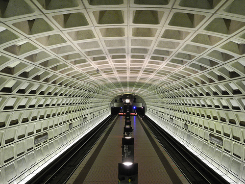
Yeah, this drives me crazy. As a DC local, the worst for me are subway scenes that are supposed to be inside Metro/WMATA stations. Underground DC Metro stations have a distinctive architectural style.[1] They also regularly get the look of DC suburbs wrong. "This character lives in Falls Church" but is shown in a neighborhood that could only exist in Great Falls or maybe McLean.
I used to laugh about the Canada effect on Stargate SG-1. It's a well-written show about traveling to other planets in the galaxy, but almost every planet looks like a forest in British Columbia because that's where it was shot.
I'm watching through SG-1 for the first time right now and as someone who grew up in BC I am actually delighted by this.
It's very fun for me seeing little easter eggs about my home region. And one huge one: They called a planet "Kelowna", which is just the name of a city near Vancouver. But who would know that unless you live nearby?
Ah, yeah, SG-1 is a good example. The 100 is another (post-apocalyptic earth). And Battlestar Galatica.
In retrospect I realized I grew up with a few major styles, including "shot in a back lot in LA" (Back to the Future), "shot on a ranch outside LA" (Little House on the Prairie), "movie set in city actually shot in city by director who loved the city" (the Conversation), and "shot at Elmstree" (Star Wars interiors).
Ultimately I want to watch a movie where I can't tell what forest it was shot it, especially if it's off-planet.
I notice that as well. Being from Canada originally, I also immediately spot the Canadian accents, even if they are trying to suppress them or do a generic American accent.
I was re-watching the first season of The X-Files and every episode I was trying to pick out where in the Vancouver the scene was shot. I was laughing when I immediately noticed they were in White Rock, BC, which was supposed to be a small town in Connecticut.
All this is more passable to me, though, than the general trend of having characters so well put together in movies. Their hair, makeup and costume is so clearly done by experts, and they are all attractive. I wish characters looked more like regular people in movies and less like models.
> I was re-watching the first season of The X-Files and every episode I was trying to pick out where in the Vancouver the scene was shot. I was laughing when I immediately noticed they were in White Rock, BC, which was supposed to be a small town in Connecticut.
In the episode "E.B.E.", Mulder & Scully go to Mattawa, Washington. As someone who grew up near Mattawa, I can assure you it looks nothing at all like British Columbia! Pull up the episode, then check out Google Street View near Mattawa for a good time.
(also, they would never get that close to a Hanford building, there are miles and miles of open sagebrush between the fence and any facilities...)
Vancouver can pass for most US cities. Just not LA. The empty streets and well dressed extra is just because everything was purposely removed from area for the shot and nothing natural remains. So shooting in Chicago or Albuquerque has the same result.
Was watching "Pieces of Her" last night (it's terrible) and there was a rendezvous at Pier 29 in SF, which was obviously not shot in SF. Distractingly so. The worst example I can think of lately.
The only thing worse than something set in SF but not shot there is something shot there, but non-contiguously. See the Bullet car chase scene for an example. How did he get from the Marina to the airport so fast?
I've lived half my life in SF or LA. Movies set in LA are even more maddening than movies set in SF, because movies set in LA seem to aggressively make non-contiguous geography a hallmark of their LA scenes. And if you see an LA-set movie at Graumann's Chinese theater, the crowd will be particularly vociferous about these blatant errors.
There's an infamous (in ireland) bollywood fight sequence which takes place on dublin's luas teams but cut to cut jumps from one line to the other to places there aren't even tram lines
I reject the premise that all Netflix shows have the same look. Just a theory, but it's possible the author is viewing HDR shows on a non-HDR TV/display, leading to a similar look as the HDR is tone mapped to SDR. Consistent tonemapping could also explain why they feel the content is dark or over-saturated.
But honestly, the other reality is that cinematography is an art, and there are trends in art. Right now, cinematographers are embracing the shadows—maybe because they're finally able to. For most of film history, cinematographers had to avoid deep shadows due to technical limitations (including film latitude, VHS, DVD and lack of color consistency on TVs).
Very possible. I really like the Netflix produced stuff because nearly all of it is in Dolby Vision
When my old TV died I switched to a new OLED one that has Dolby Vision / HDR. The colors on that are much better and the calibration is built-in so the manufacturer can't fuck it up with over saturation and too much brightness like most TV brands do. It also adjusts to the amount of ambient light via a sensor, so it's great to watch both with sunlight in the room and at night.
To be fair, 2 of the 3 available tiers of Netflix don't include HDR; if they are delivering a color palate for HDR to all of those tiers, it's no wonder it looks bad.
Yeah, if they're doing it well (which I think they are, based on viewing Netflix on a laptop) it shouldn't look bad, but I could see how using the same tone & gamut mapping might make highlights and bright colors look similar across shows.
But if they're not doing it well… We watch Apple TV+ shows on the Apple TV app on a MacBook Air, and it looks objectively too dark compared to our TV (OLED). I think the TV app is Catalyst, or at least shares a lot of code with iOS, and those devices have some HDR headroom. My theory is that app is just assuming the display is HDR, leading to ultra-dark SDR representation. It's kind of crazy, considering they own the whole stack, from silicon to the streaming service.
I first heard about network styles listening to Vince Gilligan and Peter Gould on the _Better Call Saul Insider_ podcast. Many studios have them.
A unified style streamlines production at the cost of artistry. A typical television episode has just a few days to film. So the more creative a crew becomes in their framing, lighting, audio recording etc. the less time they have to move through the shot list. It takes a talented (and expensive) crew to make this magic happen within 5-10 days.
It's to the credit of Sony and AMC that they gave Marshall Adams et. al. the flexibility to make a masterpiece out of _Better Call Saul_. But it was expensive and risky. Not every script justifies that risk and expense. Without a style guide to fall back on I think we would see fewer series overall.
Back in the day, you could always tell ABC, CBS, and NBC shows apart by their lighting and coloring. Watch Rosanne and Happy Days (ABC) and compare with old Magnum PI and 60 minutes (CBS) and Cosby Show or Cheers (NBC).
I've always thought so, too! Cool to see it discussed here because I'm not sure I've ever talked to anyone about it other than my wife.
She finds it strange that I can tell what service or channel a show is on and we've joked that its a Letterman-esque "stupid human trick" that I can do it. I can even tell the difference between football games on NBC, CBS and FOX without seeing the score bug.
Yes! This was especially obvious to me as a kid watching all the popular 90s sitcoms with my mom every evening.
ABC shows (oddly with the exception of Roseanne, now that you mention, that set really balanced it out) always had a bright, almost washed out look, eg Ellen, Boy Meets World, Drew Carey Show. NBC shows always looked more cozy and lived-in regardless of story location, eg Just Shoot Me, Friends, Seinfeld.
It's funny to me that Netflix has such strict standards for cameras, but their content delivery is usually such low quality. Maybe my friends with netflix just aren't paying enough to get decent-looking video?
One example that I remember is a horror movie where a bogey comes out of a dark doorway. I was totally distracted from the scene by the atrocious brightness levels. I won't even call it "banding", because that implies a sort of geometric layout to the levels - this was more like "blocking". It was even worse than I would normally expect from dark bt.709 content. I assume the issue was something like their compression eliminated any natural dithering that would make dark zones look OK in SDR content.
Hopefully their compression strategy does a better job with dark content using bt.2100 transfers.
SDR video barely has the bit depth to represent dark content uncompressed (16-235 YUV 4:2:0 is quite less than 0-255 RGB 480p). Highly saturated red and blue scenes also can't be represented well.
Higher bit depth video helps here, but it seems like people want to sell you 4K even if all you want is HDR. And nobody wants to pay for the 4K Netflix tier.
There's definitely a Netflix aesthetic - if you watch a lot of Netflix you'll see it. Especially in Indian/Bollywood circles, "Netflix movie" is a pejorative. It means its shot in a certain high-res way, favoring aerial shots & cutaways, with a certain unnatural ( unnatural to the Indian mileau/culture) point of view, which is not reflected in the Indian society on average. A certain casualness about foul language, obscenity, adultery etc... all of which certainly has its place if the content is some gangster flick or deals with the seamier side of life. But even if the show is about say the education sector (eg. Kota Factory on Netflix ) - they manage to make it very Netflixy. I don't know how else to describe it. Lots of drone shots. Frequent focus on the abnormalities of the place. Its certainly more dramatic. But its mining for drama that isn't naturally present in the subject matter. I like parts of it but it becomes too much to take after a point. I have to consciously turn it off and walk away, shaking my head. They make a hash of it.
Sounds like Netflix learned the wrong lessons from the success of Sacred Games (at least season 1) and tried to apply that show's gritty luridness to every other Indian production.
For Netflix, I know what he means, but the article has a hard time describing it. It's kinda like you know what a tiktok video looks like, even when the logo is absent.
But here is a better phenomenon. Star wars tv series are all shot in a circular room. Everything is arranged in a virtual circle even when they are outdoors. When you see it, you can't unsee it.
Ps: having a hard time finding images from the shows. But here is the set.
The unreal studio makes it easy to give a natural lighting to elaborate sets like those of star wars. Also less green screen needed.
But those sets are relatively small and it forces each scene to have a small circular area for the actor in the middle to act. Even for large scenes tend to feel like all the action is happening in the middle.
this is what happens when you're making "content", as martin scorsese described it.
it's like every new show they make feels like the final season of a show that lost it's spark many seasons ago - just made out of obligation to a contract. conveyor belt tv.
>Most annoying to me, everything is also shot in an extremely conventional way, using the most conventional set ups to indicate mystery or intrigue as possible—to indicate that something weird is going on the framing always has a dutch angle, for example—or more often just having everyone shot in a medium close up.
I have zero idea what the "conventional way" or the "most conventional set ups" are. Likewise, who know what a "dutch angle" even is?
I have to assume this was written for an audience of film students or people in the industry, because nobody else knows about this kind of stuff or cares.
IMO a big issue with a lot of modern productions is that they are too clean and colorful. You have a movie set in 1910 and everyone is wearing colorful died fabric and their clothings are spotless, not a hair out of place, when in reality their feet would be covered in horse shit and their hair mattled with sweat from wearing all those layers, plus a lot more smoking and drinking.
I think this comes from shooting in a sound room constantly and having every shot run by hair/makeup/wardrobe to make sure everything is perfect. Meanwhile, back in the day when they would shoot, e.g., a western, that would feel a lot more real because it would be shot on an actual movie ranch. You'd feel the heat of the sun, the characters are all sweaty and dirty. Buttons may be loosened on shirts just to make it more comfortable for the actors in the heat, just like they would be by the real character in the scene due to the heat. E.g. this shot from Once upon a time in the west is a good example (1). The sun is beating down with hard shadows. The main characters shoes are dusty, his coat is dusty from brushing on the ground, his hands are dusty, his sleeves are dirty, there is dirt all over his face, he looks sunburned, he looks like he probably smells. It feels so much more authentic.
Serious question - why does this place still tolerate Vice?
They attacked Stallman on utterly blatantly false pretenses, egregiously misquoting him. Their page is a GPDR violation. And if they've managed any quality journalism in the past ten years or so, I haven't seen it.
I'm liking The Sandman so far, being a fan of the source material like many others watching it I guess, but this critique is spot on.
I skimmed the article to see if it mentioned the "Hallmark look", and was not disappointed to see it did. One can instantly recognize the bright, bland, inoffensive and boring look of any Hallmark production, and quickly zap out of it. TFA also mentions Syfy, which is also instantly recognizable as "cheap CGI".
I can't help but feel like article kind of beats around the bush with the answer, i.e. that there are tradeoffs between artistic freedom and streaming performance/compression. I'm guessing Netflix did their best to find cameras that worked well with the compression and streaming infrastructure that Netflix has. There's probably no perfect answer, and I can understand why they'd want to specific hardware for their productions.
It's kind of fascinating that it's ended up forming a certain style, but I wouldn't be surprised to see engineering concerns start to permeate other streaming services in terms of style.
The thesis that Netflix has a prescribed look & feel is misplaced in my view. Instead, my money is on the idea that it is similar to the Instagram effect on contemporary esthetics and artists.
The critique from the author doesn't apply to many many titles. For instance the neon / indoor thing is clearly absurd in the case of Grace & Frankie. They also don't apply their "common characteristics" to animated fare...
Ozark has a very different look & feel to Atypical.
Couldn't find the point of this article, like others have claimed. But I did find it interesting they messed with the aspect ratio in The Sandman. I watched the trailer and it's incredibly obvious. A weird creative choice if you ask me. It would annoy me so much to watch that. Reminds me of my dad. Going to his house and seeing his nice large 16:9 TV showing stretched 4:3 content. And me being too polite to tell him that he's being uncivilized.
It's not just changes in aspect ratio (i.e. the shape of the frame). In Sandman, they compress the actual image, so everything looks stretched vertically.
I've always thought the Apple TV + shows exhibit the most uniform "look" of any of the streaming services. Ted Lasso is probably the most pronounced example with vibrant colors, bright/uniform lighting, and a consistent "clean" look. I guess it makes a lot of sense given Apple's design aesthetic. Has anyone else noticed this?
imo I think there is something indescribable that links some of those shows to some degree. Gorgeous, expensive, high-production values and a "mature" form of color-grading, perhaps? Or maybe that just means they look distinctly better than Netflix shows.
I don’t think this is just Netflix movies, it is almost every movie shot today. The problem is everything digital cameras and modern lenses are too “perfect.” On top of that there is a trend towards extremely bright color grading. And then when you run that and put it on a brand new HDR tv it all looks a bit insane.
Clean perfect lenses with clean digital images displayed on blindingly bright HDR TVs.
Different films and older lenses create different looks. Film studios will still rent old lenses to get certain looks and a lot of serious filmmakers are adamant about using film only. Hell, even the director of Anchorman 2 talks about how he doesn’t like the look of the movie compared to the first because he was convinced to shoot digitally. And you know what, I thought the same thing watching that movie.
Some cinematographers seem to have figured out how to make digital look like a lot like film, but that has to be a very conscious choice.
> Sandman.... fans of the show have also gotten frustrated by the show’s aspect ratio, which makes the frames look like they’ve been stretched upward.
This is an intentional choice, the elongation.
Secondly, this has nothing to do with "the Netflix Look" and the author doesn't even try to make a connection...
I've been complaining for a while that Netflix shows look like video games. While my partner counters that it's just the TV we have.
> “One of the weird things that happens when you have a very high resolution image, in general, when you shrink the amount of information the edges get sharper.”
I guess this means I'm onto something. I thought at first that this was just because NF series might have been going for a video game aesthetic (Witcher, Stranger Things), but even Peaky Blinders does it now. It's not just look either, shows also feature that excessive camera shake while in vehicles (Call of Duty), the over the shoulder fly behind common in games like Gears of War, and that very generic close up shot games use during dialogs to ensure they can use the ultra-hi-poly models at high frame rates.
Yes, it's compressed. And yes, it loses some information and quality. But the picture quality is still good. Superior to most other sources. (Yes, Blue-ray will be better, but I really don't want to jiggle disks).
I don't think that 1080p with the same bitrate would look any better.
I noticed that 1080p version of The Sandman streamed at average 3 mbit/s. I would expect that kind of numbers from Youtube, not supposed high-quality stream. The picture is still sharp and doesn't have obvious compression artifacts so there must be something else in play.
3 mbit/s is enough - most of the time. You'll see compression artifacts when objects are moving on a background with a complicated pattern (like a fence) in focus. I guess directors are optimizing for compression-friendly scenes nowadays and use larger apertures to blur backgrounds more to prevent artifacts.
The thing is that just like it was said in the TFA, The Sandman looks flat and saturated compared to anything on Amazon Prime or Apple TV that coincidentally have much higher bit rates. Maybe it's intentional attempt to make the show look like comic book and the bit rate is a side effect, maybe the other way round.
Image quality on Netflix varies between shows, so I'd guess it was intentional. Possibly the quality gets a little downgraded on a less-than 4K resolution (which also squashes the dynamic range due to lack of HDR).
Standard subscription. I doubt the dynamic range is because of non-HDR, because it's flat compared to other non-HDR content. Or maybe they compress non-HDR on purpose so that HDR content looks better in comparison?
Just skimmed the article but I've said for decades that I can recognize a German TV show or movie with any 5s clip because it just looks weird(to me), versus any Hollywood or British production. At some point I stumbled over an article that blamed the lighting technique, and I guess there are now actual German productions that do not like this, but still funny. (I guess I'm mostly talking about daily soaps, but also crime series, nearly everything produced in the 80s and 90s).
The fake-ass Depth of Field effects are what drive me nuts. Some series have the top and bottom thirds of the screen blurred to hell with a sharp dividing line for no discernable reason.
I have had so many 4k screens for so long that filming in 4k to be "future proof" felt like a slap in the face!
I have one 8k screen and am only waiting to upgrade other screens until content expands and hardware prices come down.
To me, saying 16k is the future, would have not sounded unusual. We are going to have cheap wall screens long before a show like Sandman loses its audience!
If you think this is annoying (whatever it is, the article didn't make a lot of sense to me), then DON'T look up one of the many articles on the preponderance of "orange and blue" as the standard color palette for virtually all Hollywood movies made in the last decade and going forward. Once you see it, you will start seeing it everywhere.
The same, why would netflix allocate more bandwidth which would cost them money? I know people with gigabit and obscenely huge 4k displays and netflix looks just as bad there as it looks at my parents place with a 16MBit broadband connection. In fact, it looks a bit better there because their 1080p screen doesn't have as much contrast and is much smaller so the bad quality is concealed.
If you get the $9.99/mo plan and just hook it to a 4k display with gigabit, then no I wouldn't expect improvement. I'm asking how it looks if you pay Netflix twice as much for the "Premium Ultra HD (4K)" plan. I certainly would expect them to allocate more bandwidth if you're paying them double to get the stream they say is higher quality.
It makes me sad that there's so much focus on image and VFX on Netflix while having a below average story in most cases. There are movies that consist of a person talking on the phone in a room that are more enjoyable than Netflix's feature film of the week like Day Shift.
"Extremely saturated" as in extremely de-saturated and then highlighted? Looks just awful. Even worse in 4K. That incorrect shallow focus range that does not exist outside N is also a pain.
The screenshot in the article pretty much sums it up. Looks terrible.
What’s always stuck out for me more than the visuals is the audio in Netflix shows, it’s like they’re all pulling from the same standard library. Netflix is the Bootstrap of the movie world.
Its not only netflix. Its just 4k cameras (RED and friends, I guess?) - not sure what brands actually exist.
I watched my first movies in the 90s and it took a while to adapt to the new looks but I actually love it. Its so detailed and still many elements from classical movies are adapted (if you read about them, you never forget and begin to actually see them used. Hitchcocks dolly zoom as prominent example.)
At least I am visually pleased and on my PC I actually start edge to watch 4k netflix, besides sometimes it just freezes my windows PC and just make them reboot).
> The lessons learned and art created during that time will remain and enrich the “video” or whatever you want to call the replacement for cinema.
It wont, though. That’s the thing. It’s the same thing that happened to classical animation. A hundred years of technique and mastery passed down from generation to generation, now completely lost.
Does it not live on in all ways that matter in anime? I’m not attached to a production format or a label. The future will not be short of cartoons nor will it be short of films that move people. Sure they may be now alongside a massive scale of what you don’t like but that’s the beauty of the information web.
The good anime production methods were invented in ~the 80s - 60-70s anime were based on looking at Disney once and then figuring out how to do it for much less than a reasonable budget. 70s anime is painful to look at, kind of like if you made a show out of stop motion cardboard cutouts.
So I wouldn't really call them generational. They are suffering though, as they took on too much business without getting paid enough for it, and the studios can't keep up.