I love the current infatuation with modeling old CRT display systems. Old graphics and videos from the "time before" rely a bit on how those display systems and signals worked in order to make low-color and resolution artifacts look "better" in terms of smoother color gradients and softer edges and diagonals. The shift to modern displays mades everything form that era look blocky and chunky.
The thing that makes this all really "meta-interesting" is that everybody who remembers that time remembers it differently and so there's no "correct" way to do this. We all had different TVs, monitors, different manufactures from different time periods. Some of us played color 16-bit games on tiny black and white TVs, or remember the flicker of the Atari 2600 on a giant RGB front-projection TV.
As a result we have literally thousands of filters like this that try to reproduce or at least model how these old systems looked to give back some semblance of what we remember, even if it's all entirely wrong.
I found after experimenting with a bunch of this that what seems to be more important than all the phosphor glow, scan lines, and shadow mask stuff, is that the display has to be curved for it to finally click with me. And then having reflections of the screen in the bezel are chef's kiss. It's so subtle, but just those two effects alone seem to do more for me personally than the rest.
The Megabezel project is dedicated to what I'm talking about.
It's really striking in action, how the two things (the screen geometry and the bezel reflections) really make it feel like you're looking at a television. At times I completely forget the rest of the giant flat panel even exists.
I've played with Retro Emulators that add screen reflections and scratches and bezels that look like the original artwork on the arcade cabinets, and... I love it.
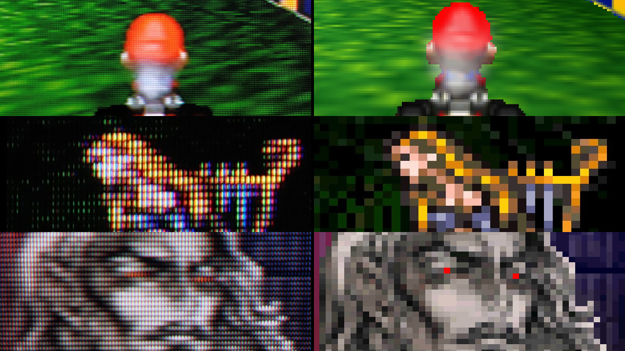
Notice how the physics of CRT ends up rendering the pixel art the way it was meant to appear. Pixel art was not the final image, the one appeared on the CRT was. You can not make up those details without CRT, shaders should get us there though. I wish this github repo had comparison images like that article.
I'd go a bit further with this claim. Most of what's being done in this space is about inventing new retro aesthetics, not about faithfully approximating how things worked in the 1980s and 1990s. For example, color TVs of that era didn't really have pronounced scanlines. They also didn't have thick, lightly-colored, reflective bezels.
I get that it looks cool and makes old games more aesthetically pleasing. But the reality is that we liked these visuals back then because we had much lower standards, not because CRTs had some magical properties that made the games look awesome.
I used my Atari computers on a black-&-white TV for years until I finally got a Commodore 1702 (JVC)... and it was like looking at candy.
The Atari and that monitor had separate luma & chroma ("S-video") so it was sharper than anything else most people could buy at the time. Most CRT simulators introduce too much degradation by comparison. This one looks pretty good.
> The thing that makes this all really "meta-interesting" is that everybody who remembers that time remembers it differently and so there's no "correct" way to do this.
I suspect it's also because the pictures weren't all that sharp to begin with, the brain filled in ('hallucinated') details. Perhaps more so with young observers.
One side-effect of this is that every time I fire up RetroArch to play a game I spend half an hour looking through every shader and still end up undecided…!
NTSC was also known for its poor colour reproducability compared to PAL due to how the color signal was modulated. PAL had automatic control where NTSC often required manual adjustment in case the hue was drifted. For that reason NTSC was often said to stand for 'Never Twice the Same Color' or 'Never The Same Color'.
I wonder if any of the shaders also has this behavior of randomly shifting the hue or an ability to change it by a give offset.
NTSC colors were bad - really bad - but wideband bayer filters + sRGB are the source of the mediocre colors we see today.
We could have beautiful Kodachrome quality colors If we used narrow-band RGB filters and a wide gamut (Rec.2020, or Rec.2100PQ) colorspace. If you look at the spectral sensitivity specs of Kodachrome film they are fairly narrow-band and closely matched the perceptual sensitivity of human vision (CIE 1931).
If you display an sRGB encoded image with Rec.2020 gamut (without colorspace conversion) the colors will appear very washed out. If you display a Rec.2020 encoded image on sRGB (without colorspace conversion) it will appear oversaturated. Separately, narrower and/or more widely spaced bandpass filters will increase color saturation. It turns out that narrow-band filters approximating the CIE1931 curves are a natural match for the Rec.2020 colorspace. Since CIE1931 approximates how humans perceive color the colors are also more accurate.
It was a "lucky" accident that the properties of CRT phosphors, from which sRGB is derived were a good match for the wideband color filters used in color video cameras.
A lot of home hardware had RGB as well. The variety of hardware in general was pretty high, to the point that many tricks pixel artists employed only worked on very specific hardware combinations. Case in point:
Notice the glass tubes at 0:47+. On the composite output, they look smooth and have that rainbow effect. This only worked on first revisions of the Megadrive; later ones had better quality output, mostly losing the effect.
The same applied to displays - crispness, scanlines, bleeding etc were all different.
I'd love to see an option to have the image pincushion and introduces a buzz in the audio from an video signal that was too strong? That was one of my favorite. Everyone focuses on the interlacing, giant pixels shapes, and the fun with chroma bleed, but some of the most bizarre things could happen when you pushed the analog signal too far. The 1 volt peak-to-peak was a rule for a reason, and going past was possible. Terms like whiter-than-white from pushing the video signal from a test pattern past 100ire on a scope could cause issues with the combined RF modulated audio/video signals. The most flagrant offender was white text. If you were competent at your job, you never used 8-bit 255,255,255 for white. That was out of bounds for NTSC, so 235,235,235 was typical instead for white.
The next filter would be the infamous "broadcast safe" filter that would clamp the video signal to video was not higher than 100ire. Allowing for chroma clamping separate from video clamping would be a bonus. Hell, just give the basic functions of a TBC to the users. They don't need to understand what they are doing to the signal so much as just a few knobs to get creative!
They were referring the fact that CRTs went the way of the dodo, and flat panels replaced them. This high frequency noise was a unique feature of the CRT.
CRTs lasted well into the 2000’s. I think the reference is to the fact that one loses the ability to hear CRT whine as one gets older, since the upper frequency limit of human hearing declines with age.
I suspect contravariant was making a joke that as you get older, your ability to hear high frequencies gets worse. After "a few decades or so" you likely won't be able to hear the flyback transformer squealing at 15 625 Hz any more.
At the end of my day at one of the post houses I was at around this time, I had to ensure all of the monitors were off. I could do it in the dark just by listening for this noise and know if any where on or not. Some of the reference monitors were never turned off though, and I had to ensure they had the correct signal routed to them to avoid burn-in.
I had an Atari ST in the living room and sometimes I would forget to turn the monitor off when I went to bed... but I was always reminded by the high pitch noise I could hear all the way in my bedroom.
Audio buzz emulation has been done already with a Gameboy emulator and from what I could recall when trying it, it was pretty dead-on. I wished I could remember which one it was but indeed, it's a rarity that emulators emulate some of the more esoteric, some might say 'unwanted', faults of the system.
Also, while the representation of the pixel grid is fairly accurate, it's missing the chromatic aberration from the fact that they were individual electron emitters of red, green, and blue phosphor dots. Pushing the red channel 0.05f and the blue channel -0.05f on the x axis should do the trick.
There's a fun technique in After Effects to separate the image by channels, and then apply an effect turning the image into grids of small circles. Nudge the red a couple of pixels left, the blue a couple of pixels right, and then the green a couple of pixels up. When these are merged back, you get that very look you've described.
Yeah, we can do it in the shader by taking the UV texcoord, sampling the texture rgb, then using a collector, add the r, g, b values to the collector with the offsets in uv's to return the pixel color. It's extremely easy to do in HLSL/GLSL/WGSL/SPIRV/Metal. It can even be controlled using a vector map for the offsets so you can tune it and vignette the chromatic aberration around the edges of the screen. Giving it that truly retro CRT arcade feel. The more the spherical projection, the more aberration.
The first time I spoke with a 3D graphics type person that started to talk to me a video engineer type person about UV this UV that, I could not grok their use of the chroma channels needing coordinate position. Just another example of how terms get new definitions depending on the field using them. To this day, my default for UV is chroma related, not projection related, so I sometimes have to re-read something in the right context.
Thanks! I once read this article and could never find it again.
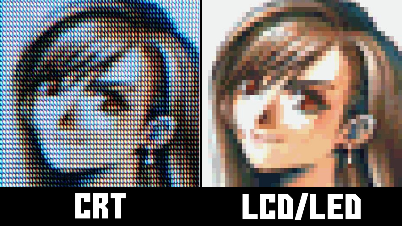
The screenshots here are second to none for showing why the quest to reproduce CRT rendering is so important for preservation efforts. Without it graphics from this era simply don't look even remotely as intended.
Windows ClearType text rendering exploits subpixel artifacts to increase horizontal text resolution.
Any kind of subpixels will result in some sort of artifacts. Tne higher the resolution, the less visible it will be, but it probably requires around 300 DPI to become imperceptible.
I'm really excited by the current appreciation of CRTs. There is something so nostalgic about them that matches the warmth of listening to my favorite vinyl. I have had much more fun playing SNES and Genesis via my MiSTer on a PVM than I have had playing most modern games on an OLED display (although OLED is unquestionably beautiful, and I'm looking forward to the OLED Steam Deck).
My biggest concern with my current setup is what will happen when my PVM dies? Will there be anyone around to fix it? Will I trust myself to safely open it up and fix it? The PVM I have isn't _too_ large, but it's certainly more heavy and inconvenient than a modern display. I'm really excited by the excellent work towards recreating how good CRTs look to preserve this bit of history and also provide another artistic option for future games to consider.
My son (15) got hooked up on using old-"tv" effects, but he was not happy with existing shaders, Adobe Premiere / After Effects / etc, so by pure luck one day driving home saw an old Cathode TV/VHS combo boxset left outside for someone to pick up - and I've got it - the VHS does not work, but he's now happy with doing the effects he wants (plus old Hi8 camera for others).
The shadow mask is overly represented. This may work better on a yet even higher resolution display, or perhaps there's an option to reduce the shadow mask effect. The other thing that this emulation can't get right is that phosphor-based displays had more vibrant colors (at lower intensities) than currently popular (IPS) LCD panels. VA panels are better for this.
Is it? When I look up "CRT macro lens" on Google Images [1] the shadow mask is extremely pronounced -- possibly even more than here.
I've just tried looking at the screenshots on both a Retina and non-Retina display, and they seem pretty faithful to what I remember growing up. I'm really quite impressed.
Also -- what do you mean by "more vibrant colors"? If you mean (presumably) greater color saturation = wider color gamut, I can't find any source supporting the idea that CRT's had a wider gamut than modern IPS panels -- to the contrary, IPS seems to be at least as good if not better (although early LCD displays weren't). And P3 IPS displays like Apple's certainly blow CRT color gamuts out of the water.
The vertical RGB shadow mask specifically wasn't unconsciously visible at normal viewing distance--usually only the raster lines were. On these screenshots, I can see and almost count horizontal pixels. This could also be because most shadow masks weren't the RGB stripes like most LCDs--the Trinitron was with a cylindrical CRT. The shadow mask was usually also more fine than the max resolution so there was no 1:1 (or 3:1) mapping to pixels as there is in this simulated display.
I don't mean wider color gamut, I mean that for lower intensities, the saturation can remain high. Most current IPS panels at lower intensities, the color saturation gets washed out (think DLP projector). This correlates with having deep AND distinguishable blacks. IPS has high brightness, VA has higher contrast ratios.
Because of this, I probably won't buy an IPS panel except for 'business' text use.
The LG/Dell Nano IPS Black (aka IPS Black and different than Nano IPS) is reported as being better--I haven't seen it in person so can't comment.
Mind that CRTs had a viewing distance, much like the subject point in classic painting. E.g., at this distance, dithering tended to blend into a solid tint on common consumer CRTs. (The granularity of a shadow mask is generally smaller than that of a pixel/PEL, so there are actually two kinds of rasterization involved, which helps blending. The effect also depends on the shape of the mask, as in round, oval, square holes, or even a Trinitron-style wire mesh.) Also, the expectation to actually perceive CRT colors when reproduced on a modern panel may be overly optimistic.
I'm generally impressed by these shaders (they are about the best, I've seen), but I also think that colors are too muted and that the mask is overrepresented.
Edit: Regarding CRT intensities, mind that a CRT set up for daylight viewing would give you headaches when viewed in the dark, which is hard to achieve with a modern display panel.
> Regarding CRT intensities, mind that a CRT set up for daylight viewing would give you headaches when viewed in the dark, which is hard to achieve with a modern display panel.
Are you suggesting CRT's were brighter than modern LCD screens?
That's not the case at all. Average consumer CRT's were 100 nits, the super-bright ones in the 2000's around 200 nits. While your cheapest MacBook is 400 nits, and iPhones have been over 600 for a long time. (Current cheaper laptop brands can be lower around 200 today though.)
Were you looking at color or black-and-white? I always felt Apple II graphics were pretty meh due to all the color artifacts/fringing on composite monitors (IIgs being the exception, those generally had RGB monitors.)
I grew up in the 80's, and the Apple II was basically everywhere in education! I remember we had a lab full of Apple IIe's. I had a IIc at home, but moved on to the Amiga sometime in middle school.
I was born in '97 so I grew up in the 00s and 10s.
I don't think I would have gotten into computers without Linux, the Internet, or the ease of PCIe - however I still appreciate being able to truly understand a computer from top to bottom like you can with old 8-bits. It's also really fun hunting for them online and meeting cool people.
I always hated the weird fuzziness, soft lines, and curved image that old TVs imparted on games, it is amazing to me that entire communities have been built up around it. When I started playing games on an emulator and pixels were hard and square and the image was actually flat, I was like YES!!
It's interesting, because artists on some games accounted for the fuzziness and used it to their advantage. You should play them how you want of course, but for something like Gameboy emulation I absolutely turn on shaders to avoid the nasty black-and-white.
> because artists on some games accounted for the fuzziness and used it to their advantage
Everybody repeats this, but I've honestly never been convinced.
Different screens and different systems had different types of different degrees of fuzziness. Designing for it seems like it would be impossible.
I've never once seen an example of pixel art that looked good crisp and bad fuzzy, and then was somehow modified in a way to look worse crisp and yet better fuzzy. It doesn't even make sense to me how that could be.
I'm happy to be proven wrong, but I need to see an example with my own eyes. And I've never seen anybody demonstrate it with a 2x2 example like that.
Super Mario on a crisp LCD has always seemed aesthetically better than on a CRT. Not as nostalgic, sure. But nothing feels lost artistically -- to the contrary, it's clearer.
No, it doesn't. How would you even do that? Nobody has ever managed to explain how that would result in a different design -- not that I've been able to find.
> Once the industry switched from hexadecimal to graphic editors, it wasn’t rare for graphic designers to have not one but two screens on their desk: a computer monitor and a CRT, the second one being used to display the result of the work made on the first one. It’s hard to tell whether this was a standardized practice or not, but we know that many developers, graphic designers as well as programmers, used that technique, from Kazuko Shibuya (Square) and Akira Yasuda (Capcom) to the developers behind Thunder Force IV (1992) who used many CRTs to take into account the specifities of each kind of screen. Masato Nishimura, graphic designer in charge of the backgrounds from Sonic CD, mentioned something he had been told about the first Sonic the Hedgehog (1991): the developers used up to 3 CRTs to previsualize the game and see how were rendered the scrolling and blur effects.
> This practice can be explained by at least 3 reasons. The first one is related to the differences in rendering between a computer screen and a CRT, the pixels look generally sharper on a monitor. The second one lies in the specificities of each machine: display resolution, shape of the pixels (rarely as square as one would expect), rendering of the colors -the red color bleeded on the others on Mega Drive, it was recommanded to add neutral colors around to compensate. The third reason is related to the second one but also concerns programmers: a workstation doesn’t necessary simulate every aspect of the machine for which a game is being developed. For example, the parallax scrolling effect featured in the Mega Drive game Thunder Force IV couldn’t be tested on X68000.
> Tatsuro Iwamoto, graphic designer on the first episodes of the Phoenix Wright / Gyakuten Saiban series released on Game Boy Advance, explained that he took account of that (sometimes unwanted) effect on Nintendo’s portable console.
Thank you! That explains it in detail that I'd never been able to find before. Especially the part that immediately follows:
> Some graphic designers toyed with these specificities and mastered the 0.5 dot technique... “It’s a technique where by slightly changing the color of surrounding pixels, to the human eye it looks like the pixels move by around 0.5 pixels.” explains Kazuhiro Tanaka, graphic designer on Metal Slug (1996). His colleague Yasuyuki Oda adds that “Back in the old days, we’d say [to our artists] "add 0.5 of a pixel”, and have them draw in the pixels by taking scanlines into account. But with the modern Full HD monitor, the pixels comes out too clearly and too perfectly that you can’t have that same taste.“
That's a clear example, then, of something that looks worse in full-res. I hadn't been able to find an example like that before.
Thanks again -- this finally explains something I really didn't understand for the longest time.
Apologies, this article comes up on HN every year or so, and I assumed someone whose been here so long and was so steadfast in their opinions of the topic would have already come across it.
All of the retro shaders and things like cool-retro-term seem to overdo the curve too, making everything look like a 9" TV, when for me 14" was the most common size and much less pronounced curvature. The tail end of my CRT experience however was 19" and 21" Sony and Viewsonic flat tube monitors with trinitron masks and 36" trinitron TVs, so retro stuff never looks right.
I had the same experience going switching between CRT and LCD e.g. I disliked playing games on the PlayStation on our CRT TV (using crappy analog RGB input) but loved playing games on my GameBoy Pocket with its crisp LCD screen. Even when LCD TVs came along it was a while before the input became digital and lost all of that analog fuzziness.
I doubt there's much difference. Just implementation details. The retroarch spec is a lot to code if you're just looking for one or two shaders.
Also FYI: your link features a lot of shaders using the megabezel presets, which are extremely unoptimized. The koko-aio bezels in the same slang-shaders repository can do the same effects, but with much better performance.
Yes now that you say it. It was possible to go higher on VGA also and get dithering. And it was also the case for the vieeo out on composite or svideo. The result was barerly readable mud.
The biggest value is when you are emulating hardware that output to such a display. Often the designers of software (especially games) optimized their art for the display. Castlevania Symphony of the night is one of my more favored examples of this, look up a crt-lcd comparison
Aside from thqt, maybe artistic looks for new video...
People notice flicker below about 50Hz. So two 1/2-frames at 60 Hz gives flicker-free viewing of 30 fps video. The “light chaser phenomenon” kicks in at 15 Hz, so that is the minimum full-frame rate for the illusion of smooth motion.
So when can I load these into my TV and turn my 65” UHD TV into a 25” Curtis Mathis console (mini-bar optional) from 1978?
Seriously, my wife is into Mid-Century Modern - a wood console CRT emulator would be awesome. I may need to set up a machine to connect to the TV. But I’d like to watch streamed shows on it.
All these CRT emulations seem to be optimized for realtime filtering (especially for retro gaming). What I am looking for is a high quality CRT node for Nuke, Natron or Blender. Is there something like that?
The thing that makes this all really "meta-interesting" is that everybody who remembers that time remembers it differently and so there's no "correct" way to do this. We all had different TVs, monitors, different manufactures from different time periods. Some of us played color 16-bit games on tiny black and white TVs, or remember the flicker of the Atari 2600 on a giant RGB front-projection TV.
As a result we have literally thousands of filters like this that try to reproduce or at least model how these old systems looked to give back some semblance of what we remember, even if it's all entirely wrong.
I found after experimenting with a bunch of this that what seems to be more important than all the phosphor glow, scan lines, and shadow mask stuff, is that the display has to be curved for it to finally click with me. And then having reflections of the screen in the bezel are chef's kiss. It's so subtle, but just those two effects alone seem to do more for me personally than the rest.
The Megabezel project is dedicated to what I'm talking about.
http://www.megabezel.com/